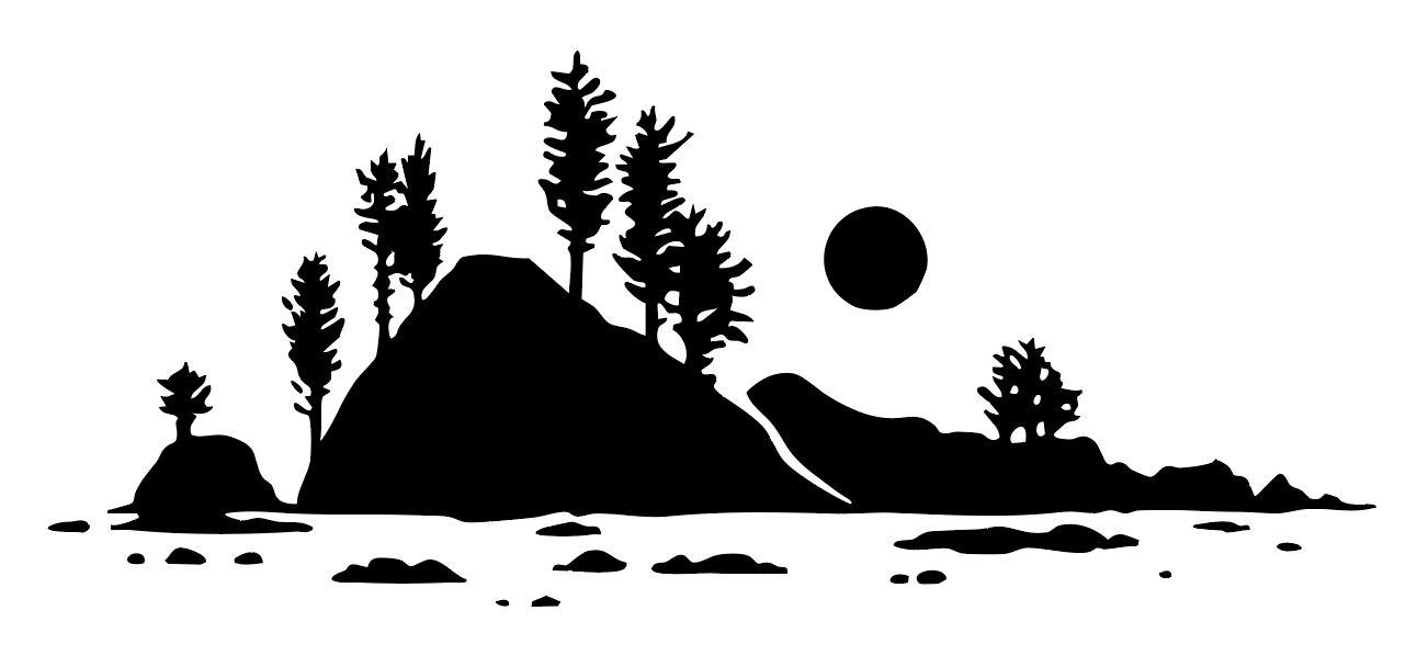
Packaging Design

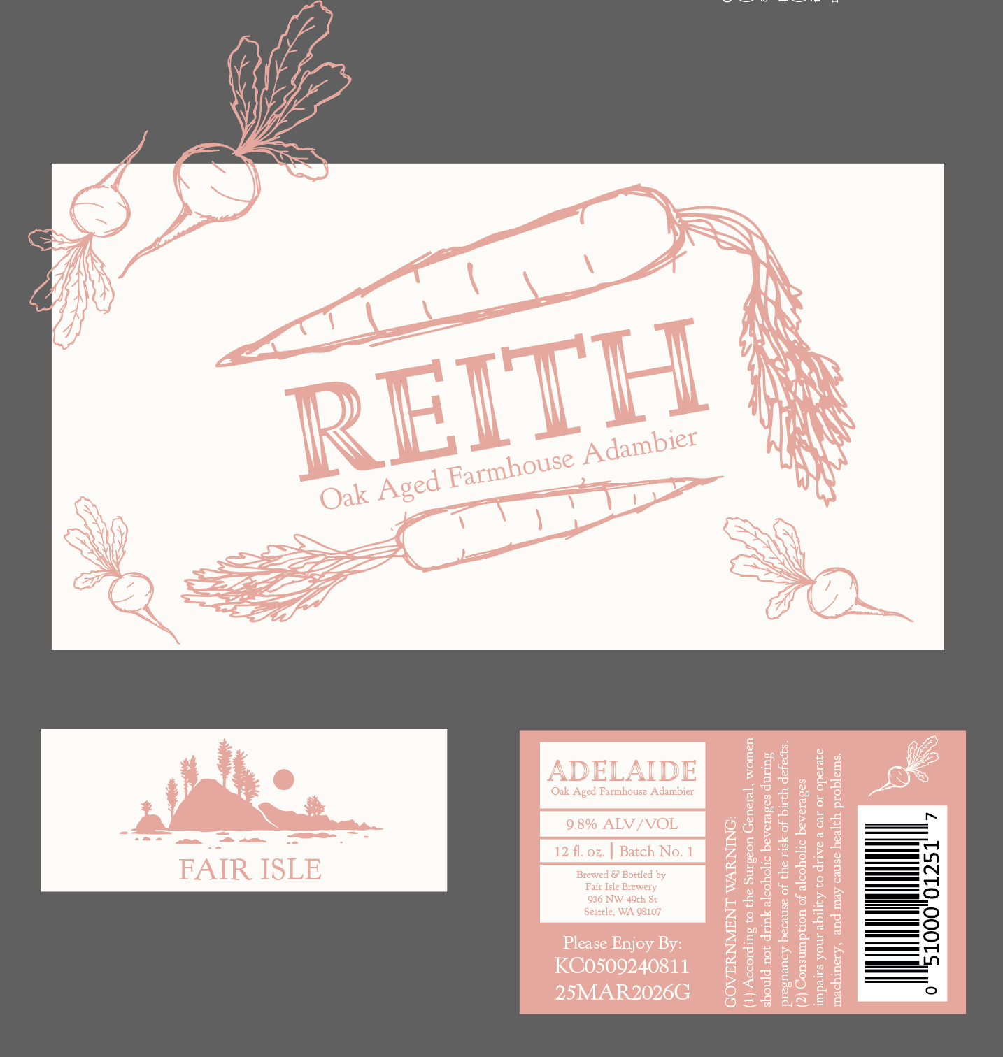
Reith
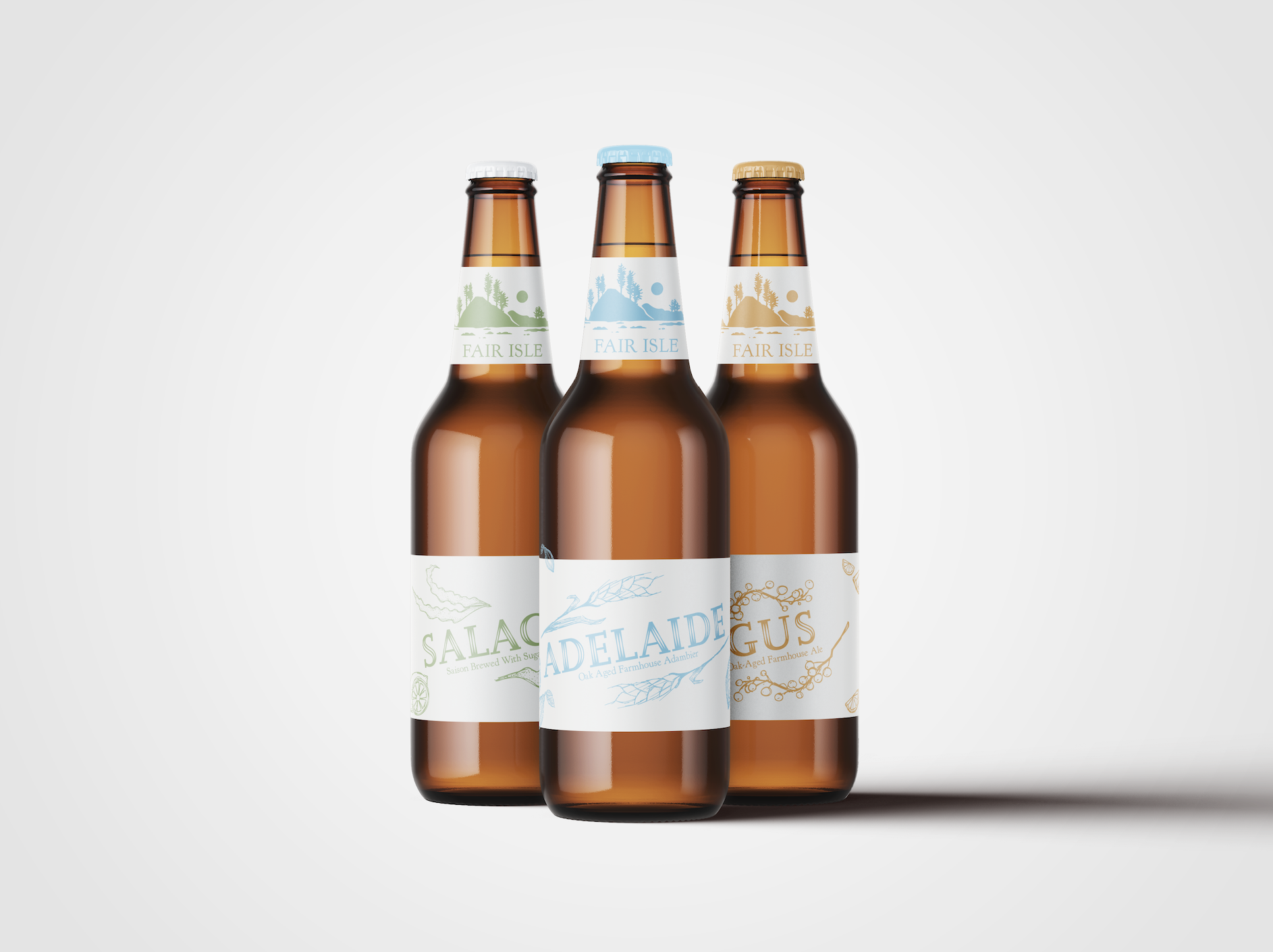
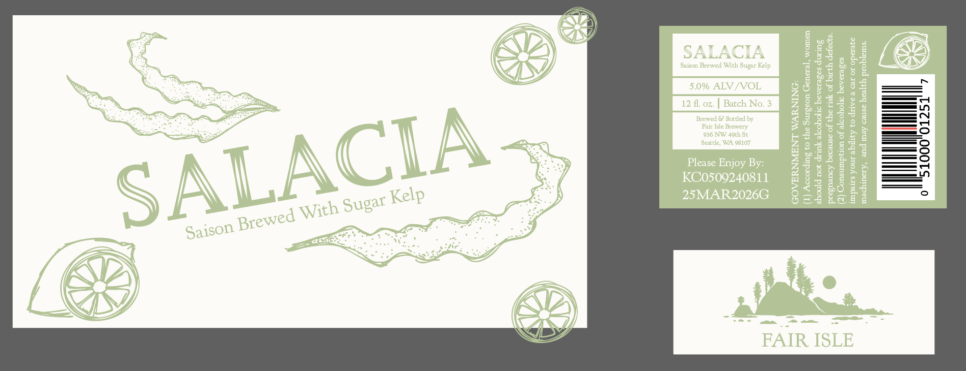
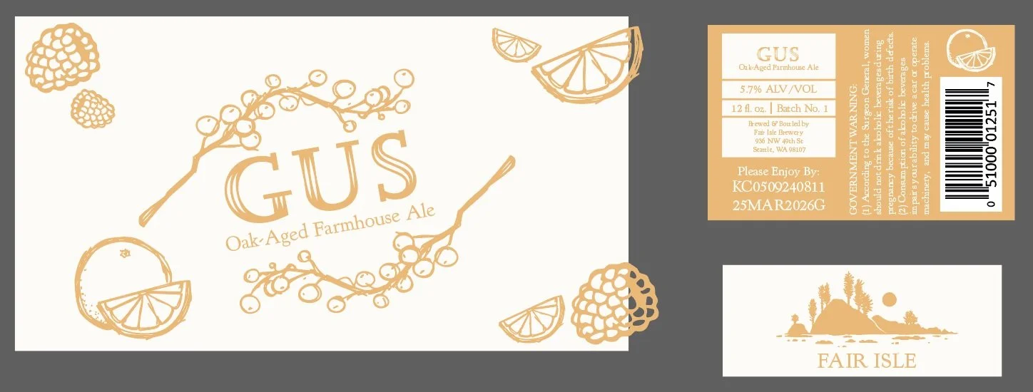
Gus, Adelaide, & Salacia
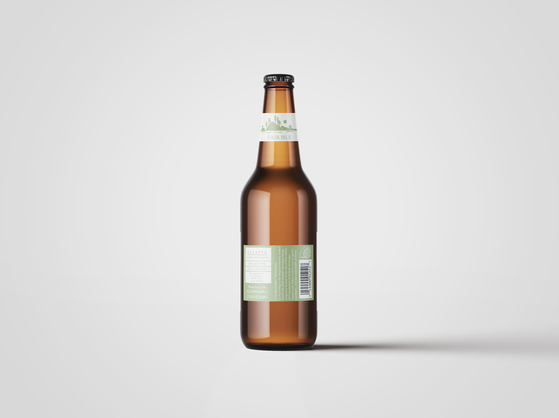
Back of the Bottles
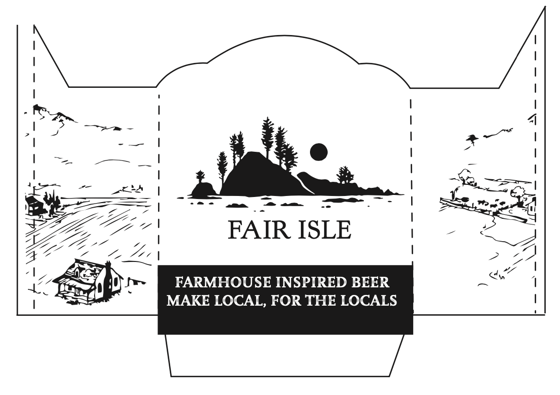
Carrier Design
The carrier was designed to complement the colorful bottles, while also still being bold enough to stand out on a crowded shelf.

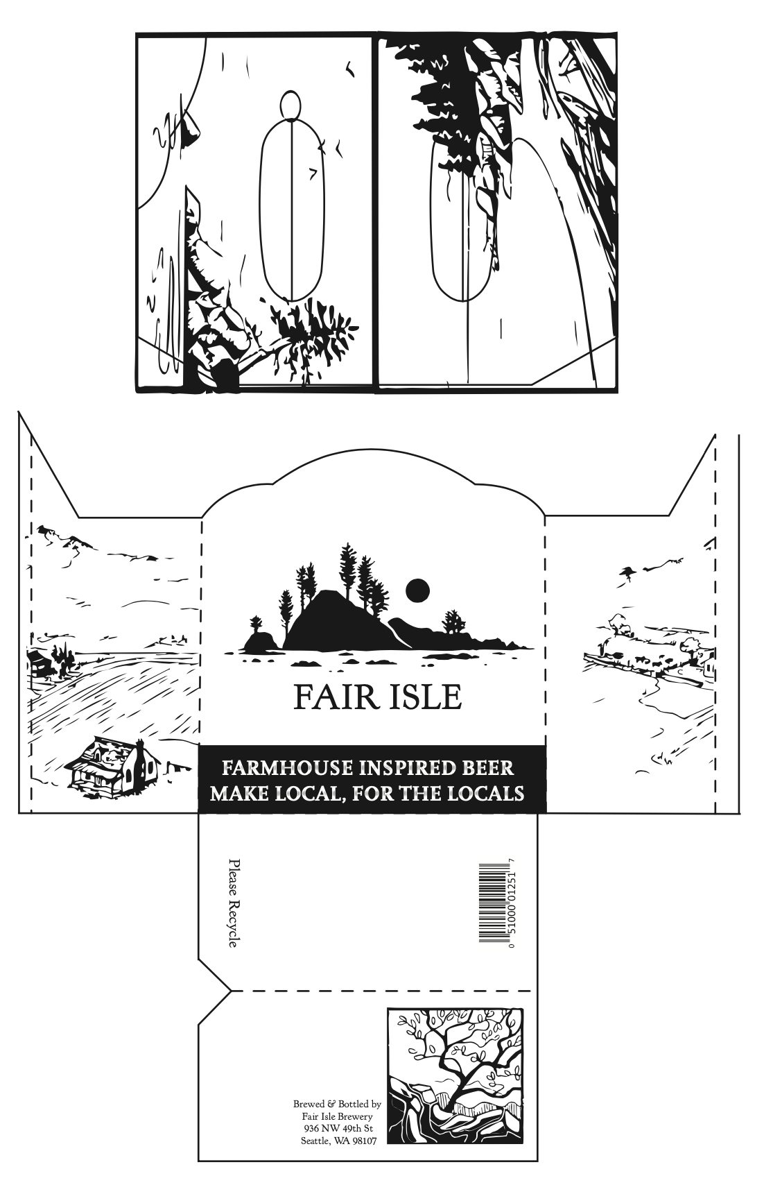
Digital Versions & Nets

Labels
Each bottle has three labels, one that goes on the front that has the name of the beer and most of the graphics, the one that goes around the neck of the bottle with the company’s name on it, then the one with the warning and information on it. I paired each beer with a different season (Adelaide for winter, Salacia for spring, Gus for fall, and Reith for summer) and picked a color that would go best with it. Then each of the illustrations is the beer’s main ingredients.
Nets
The illustrations on the carrier are of scenes from the Seattle Region, since the company prides itself on its local ingredients.