
Olympic Branding
This branding project reimagines the visual identity for the 2032 Helsinki Olympic Games. The system includes a comprehensive brand identity book, event posters, a custom logo set, and a cohesive suite of sport icons. This project focuses on creating a unified and versatile brand presence that celebrates the spirit of global connection and athletic excellence.
Brand Guidelines
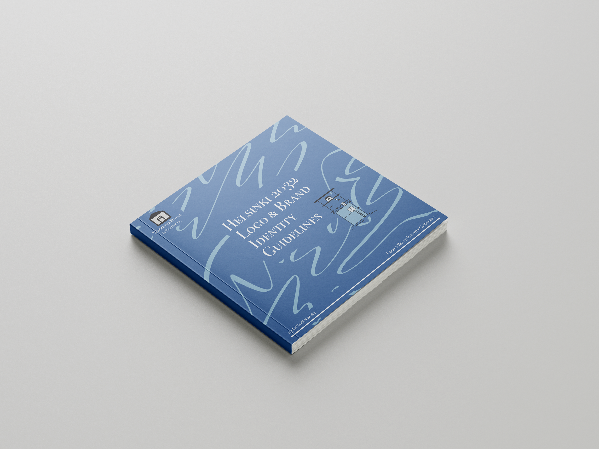
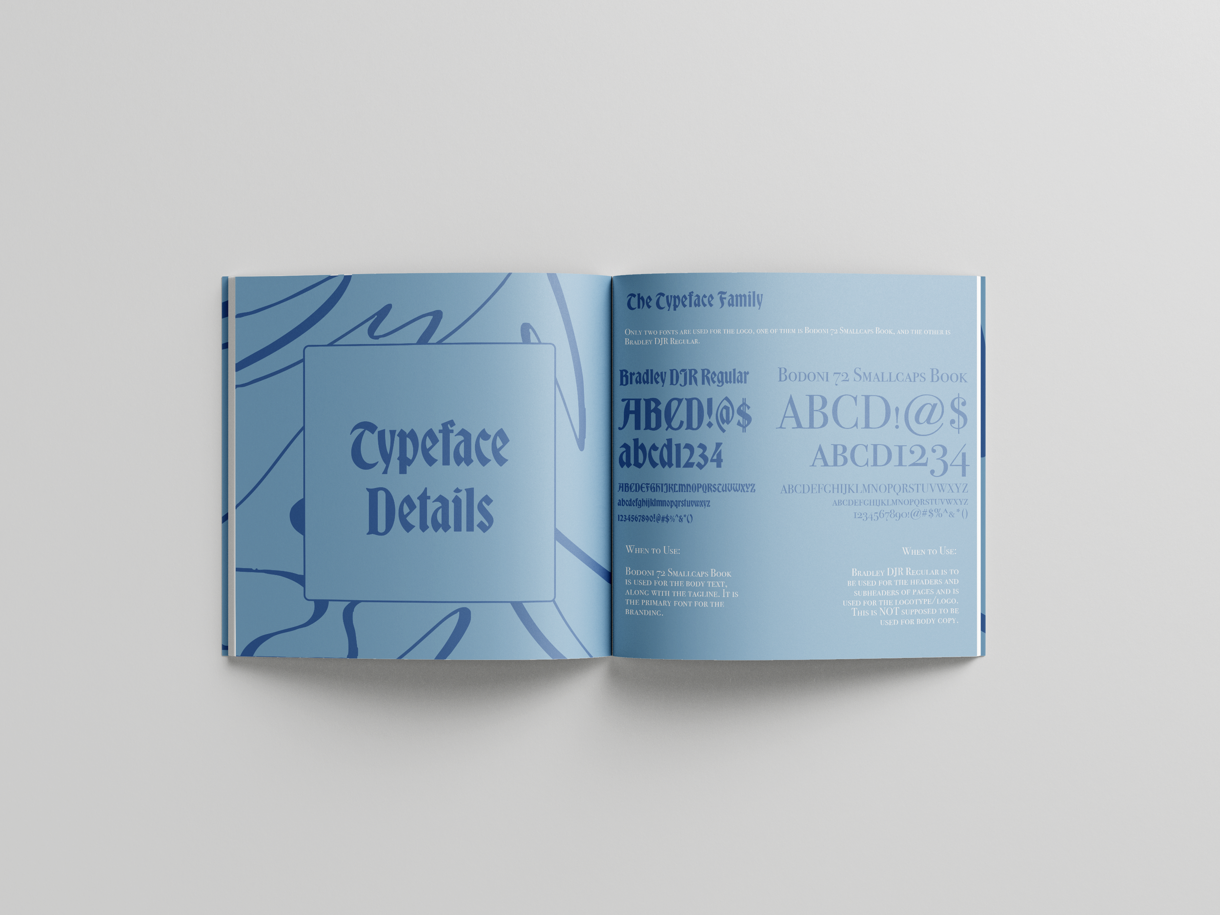
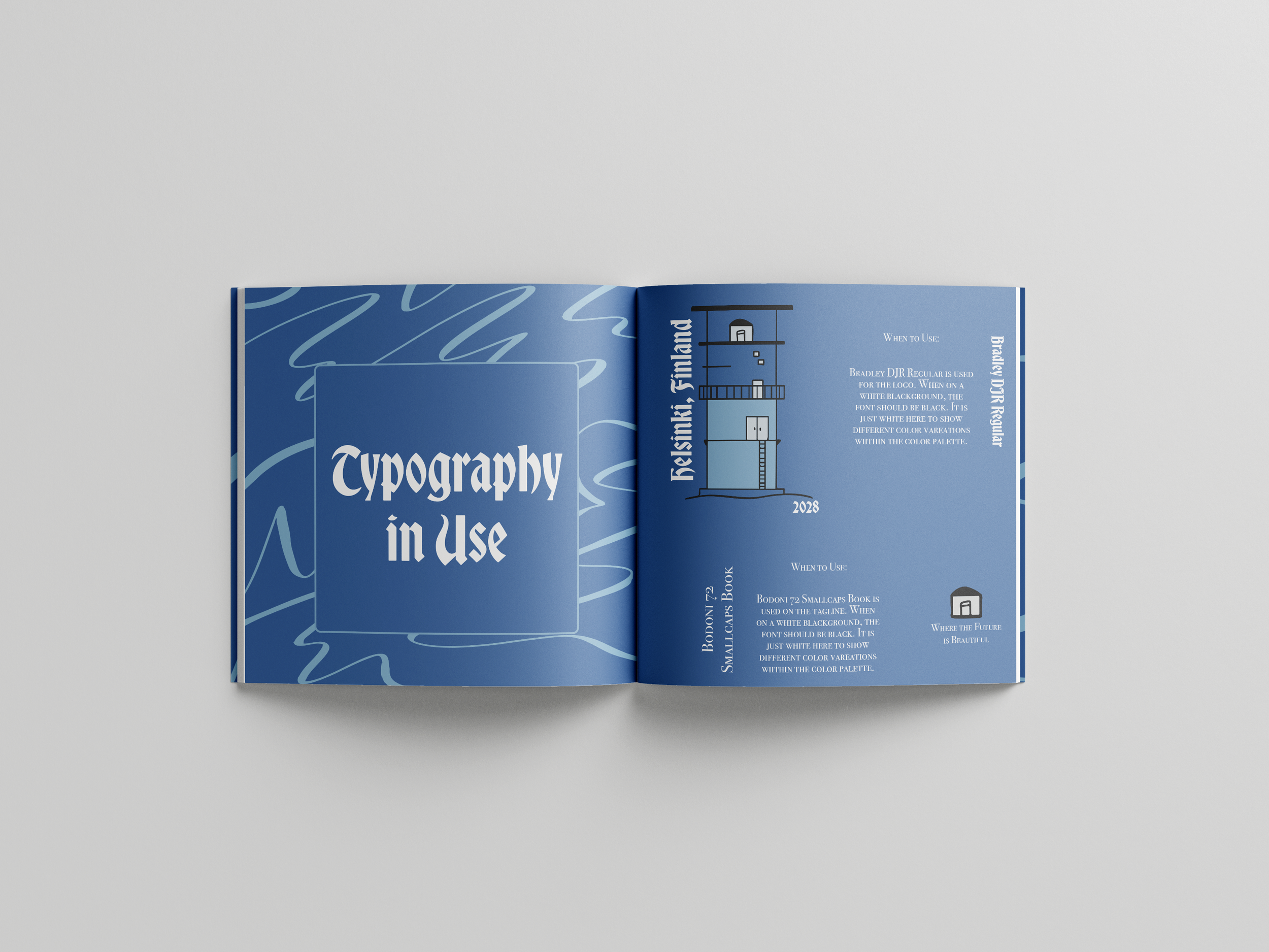
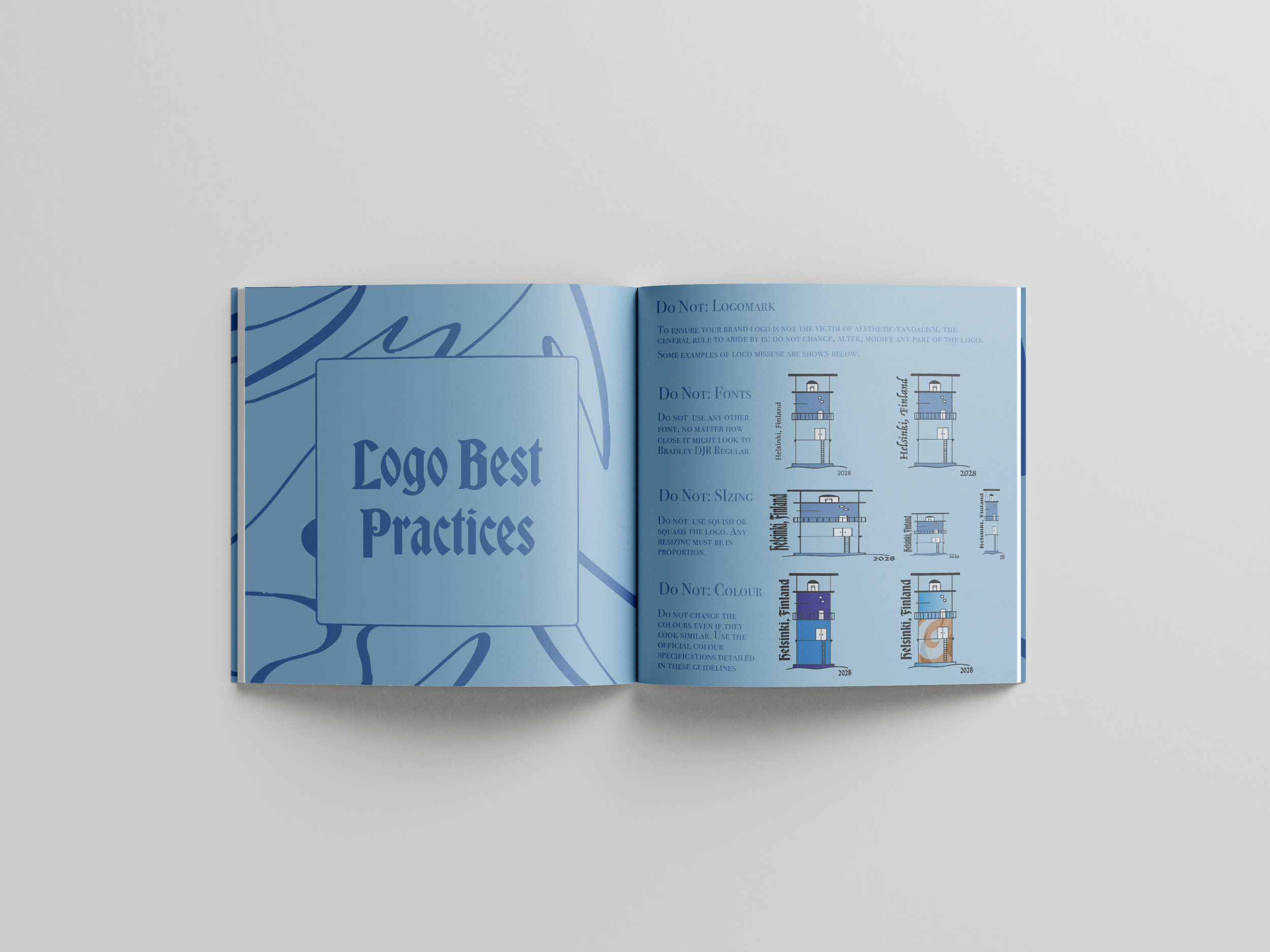
This book outlines the brand identity of my 2032 Olympics. It includes logo usage, color palette, typography, icons, and how not to use these items. Brand identity is important so that every part of the design is similar, even if it’s made by multiple different people.


Other Ideas
Here are the other ideas for the logos for this project. The first one is the lily of the valley, which is Finland’s national flower. Then the other is a famous piece of architecture in Helsinki. I took the color palette from the architecture piece and eventually gave it to the lighthouse, since it is more nautical.
Finialized Logo
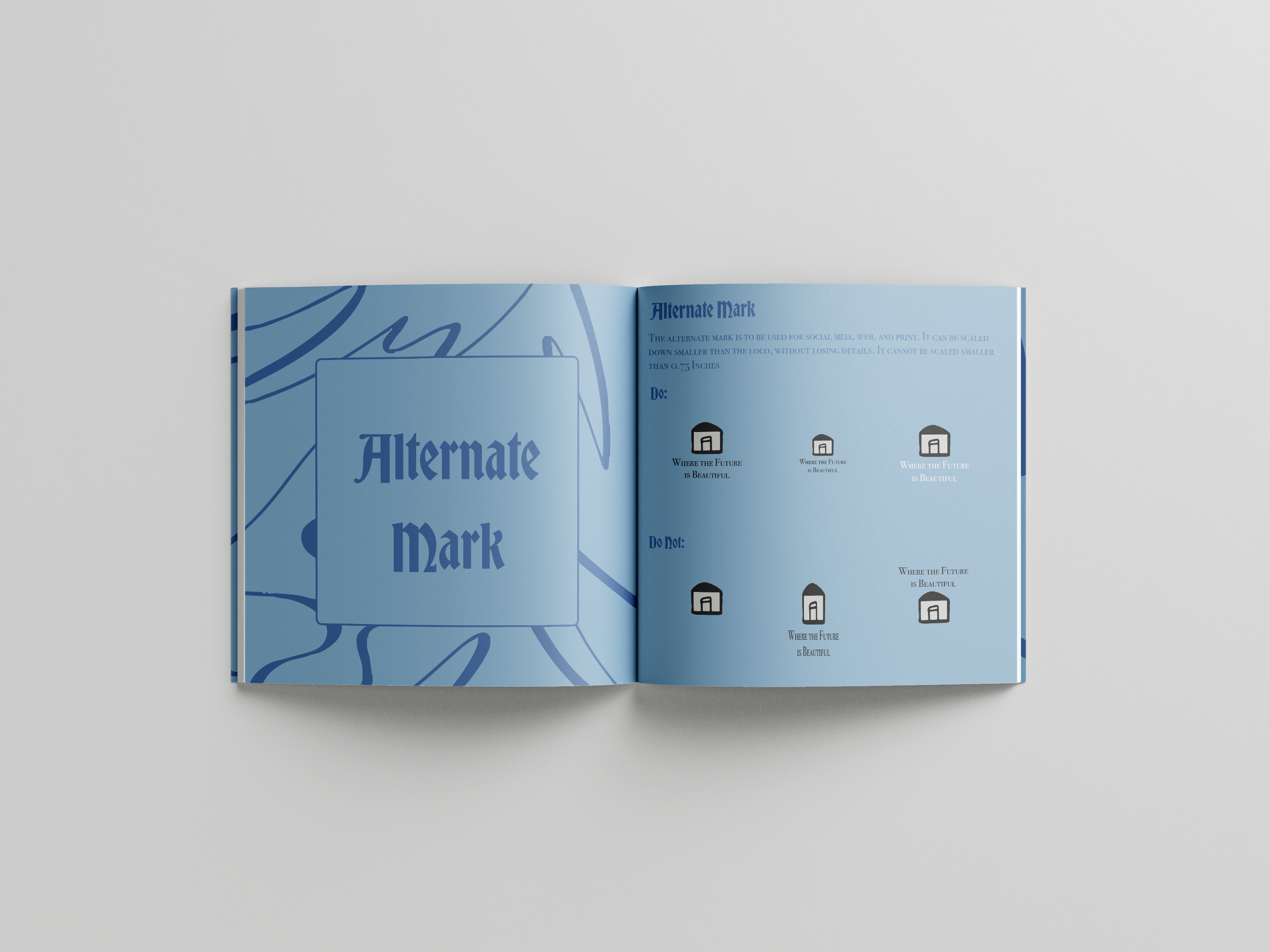
The final draft of the logo includes the alternative mark. This logo is based on one of the lighthouses that is just off the coast of Helsinki, and it sets the scene for the rest of the branding for this project.

Icons
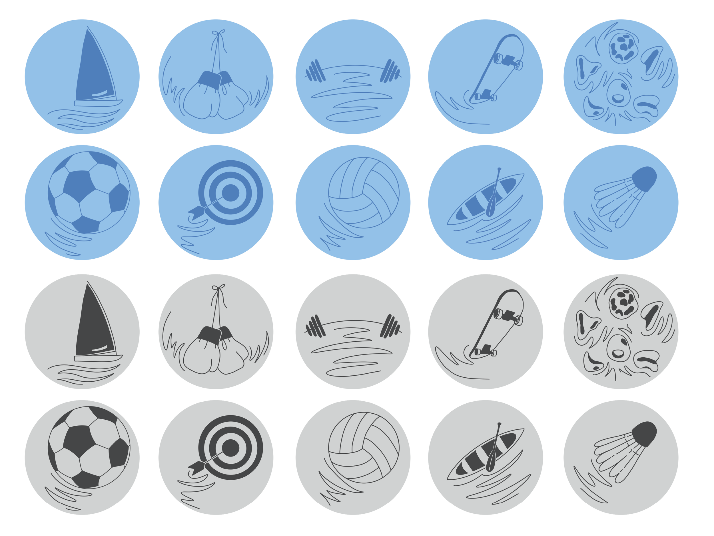
This set of twenty sports icons was designed to reflect the energy and motion of the Olympic events. Each icon was both a color version and a grayscale version, which would allow for flexible use across a wide range of items while preserving a similar feel throughout everything.

Posters
A series of three promotional posters that were made to capture the energy of the different events and the athletes who compete in them. While at the same time staying in line with the colors outlined in the brand guidelines.

