Bay Area Book Festival
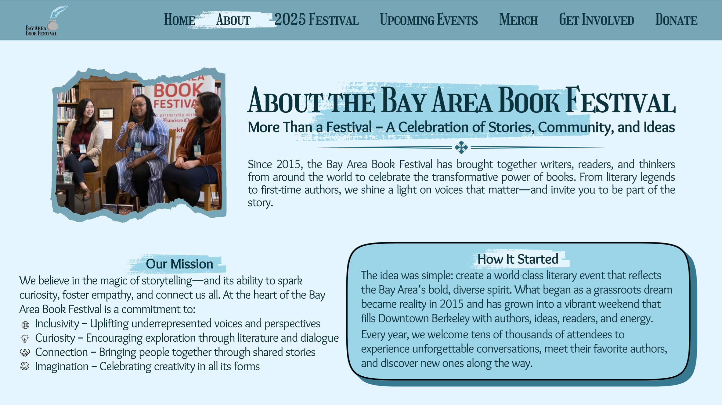
The Bay Area Book Festival is an annual celebration of literature and creative expression. For my senior project, I rebranded the festival. I focused on creating a cohesive visual identity and made a wide range of materials for this event, from logos to posters to web design. The goal was to create an energetic and playful brand that welcomes book lovers of all ages while reflecting the spirit of the Bay Area.
Logos
I mocked up 3 logos and did type and color studies for all three. The ones of the right are the finized versions and the one below is the one that I went with as my final logo
Ad Campaign
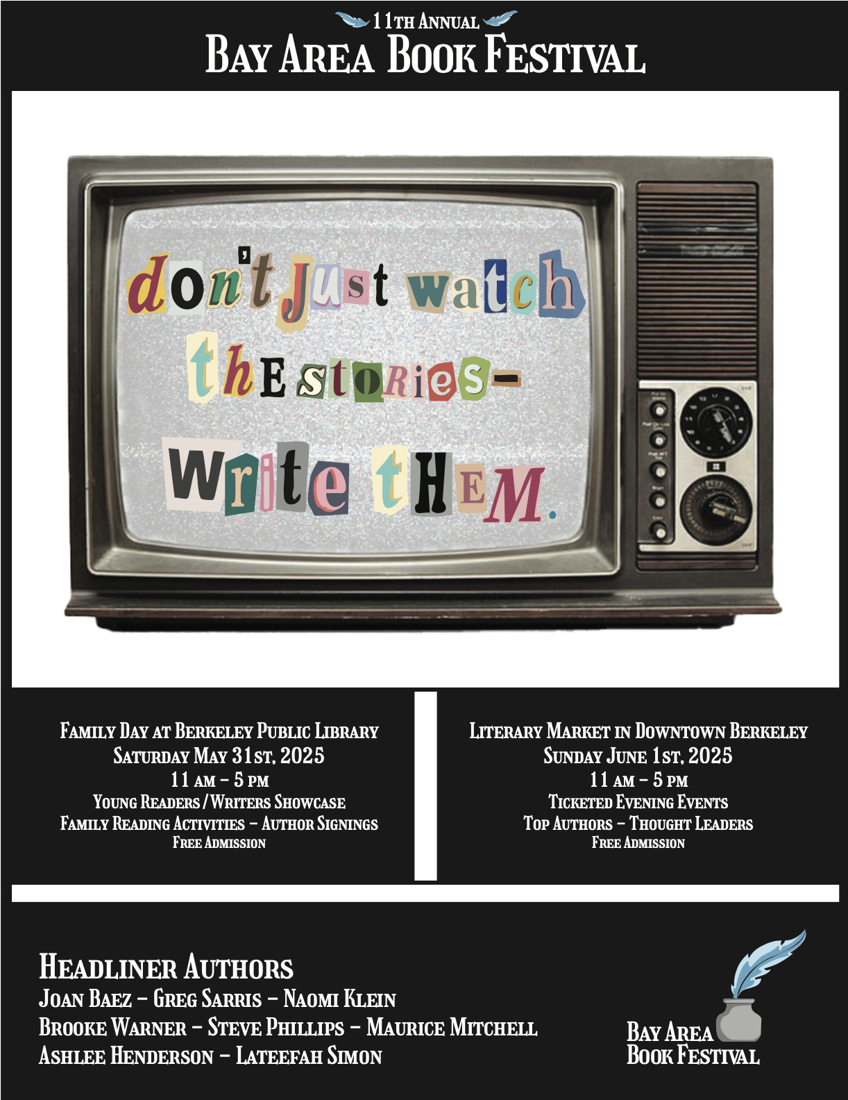
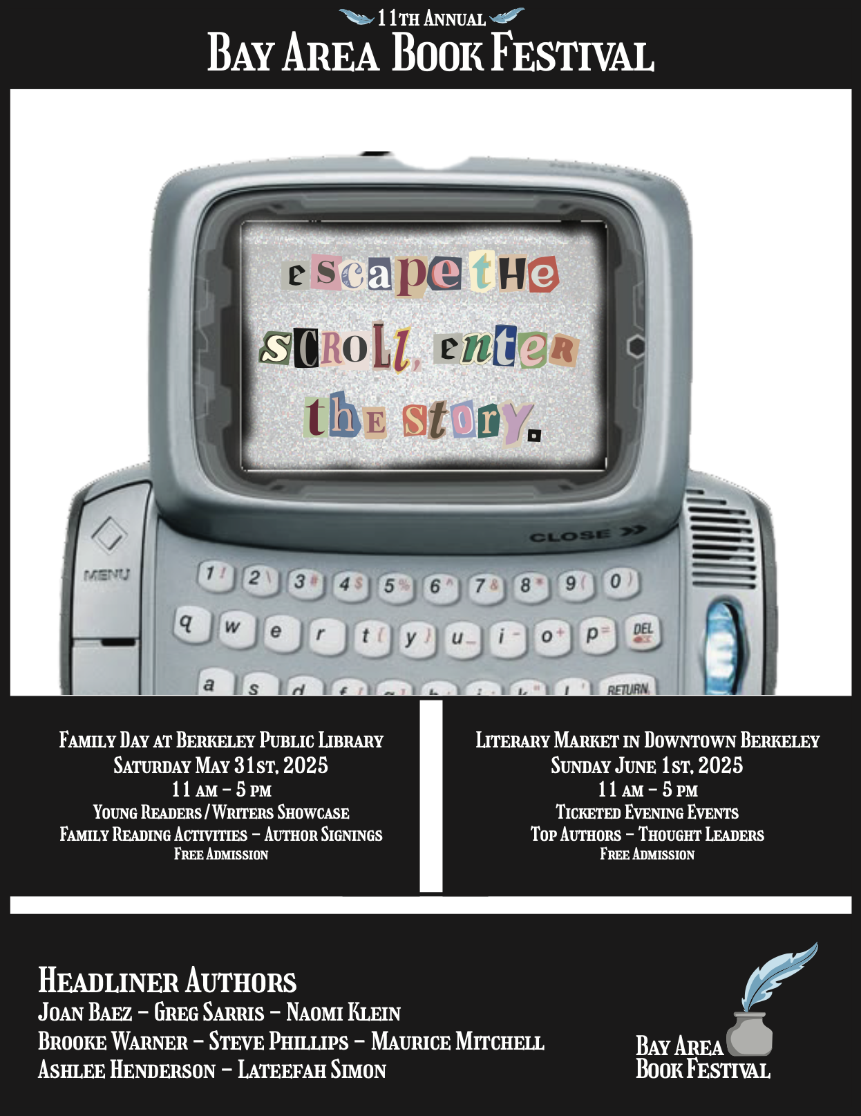
A set of print ads that were made to be hung up in coffee shop. They are supposed to catch the viewers eye and instill the idea that this festival is about unplugging from the digital world and connecting to the written word.
Posters
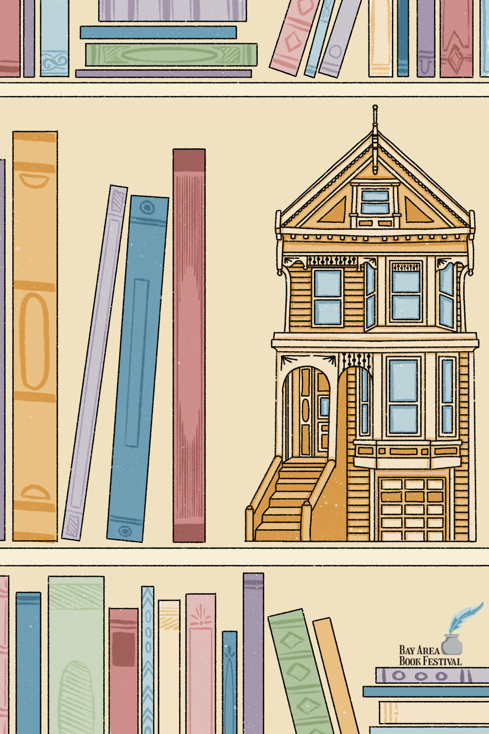
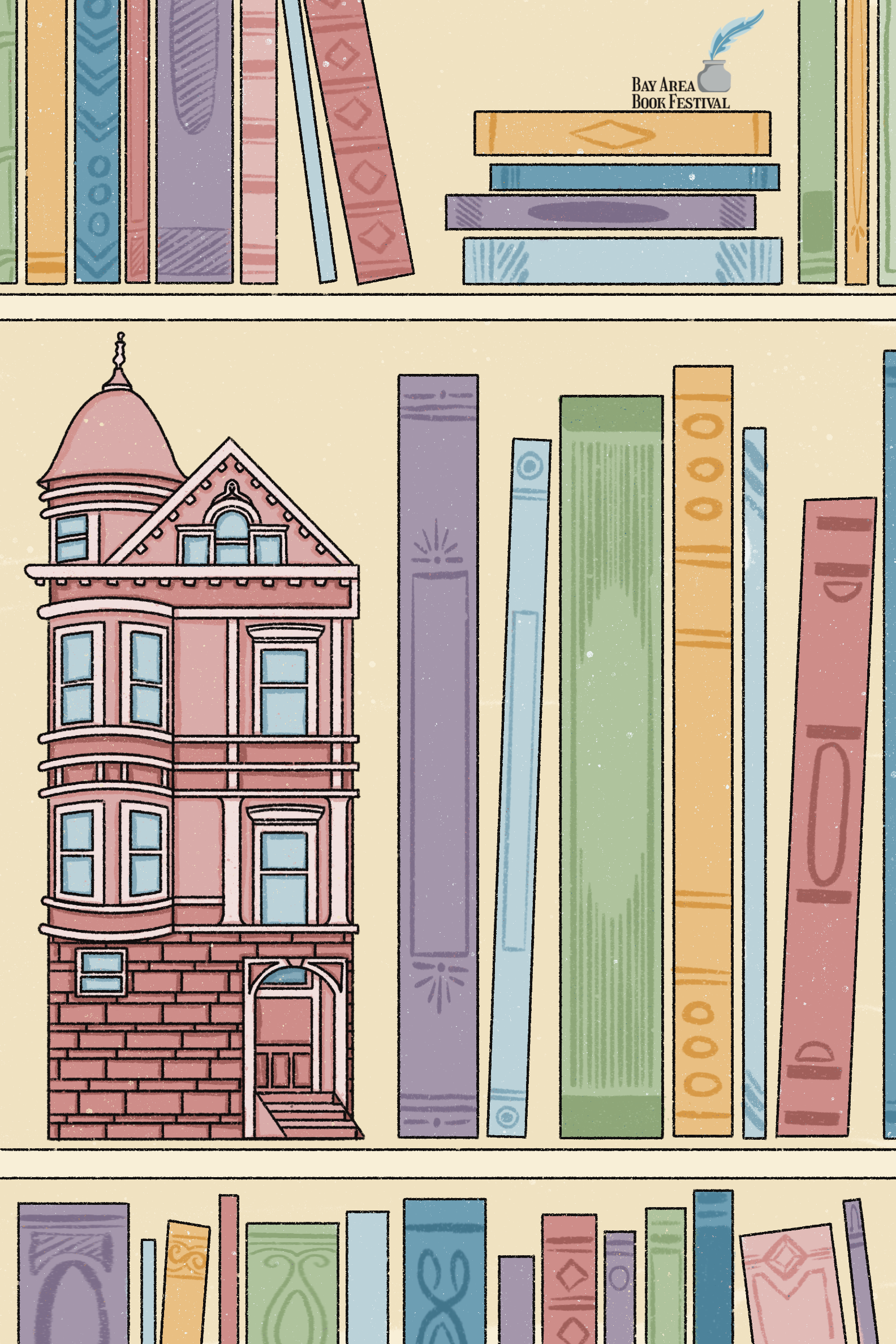
This poster series, which is also featured in another section of my portfolio, blends local character with literary themes. Each design features a stylized home that is inspired by iconic Bay Area architecture, such as the Painted Ladies. These posters invite viewers to step into the world of the festival.

Tickets
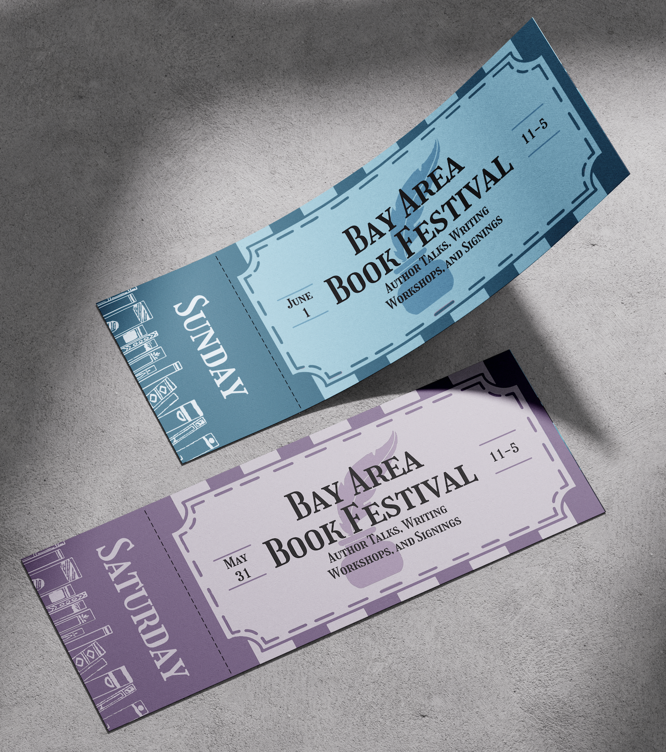
Tickets reflect the brand identity while offering event-specific information, such as the date and different events that are featured. These were made to feel like a keepsake, something you would want to keep
Festival Map
A clean, illustrated map that helps people be able to navigate the event space with ease. The colors match those of the posters and logo. Below the map is a schedule organized by time and place
Website Design
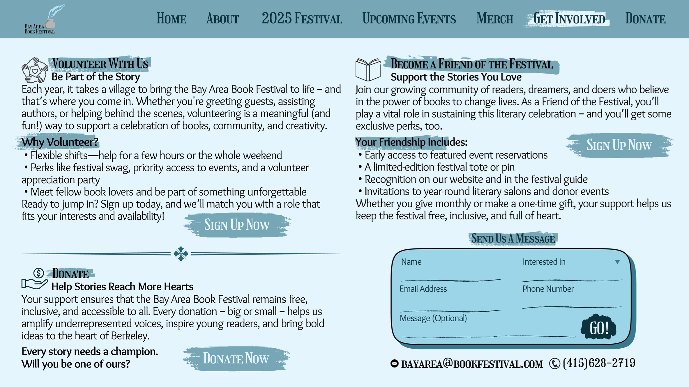
The website is built to inform, engage, and guide users to important information. The visuals extend across each webpage to create a uniformed look.
Merchandise
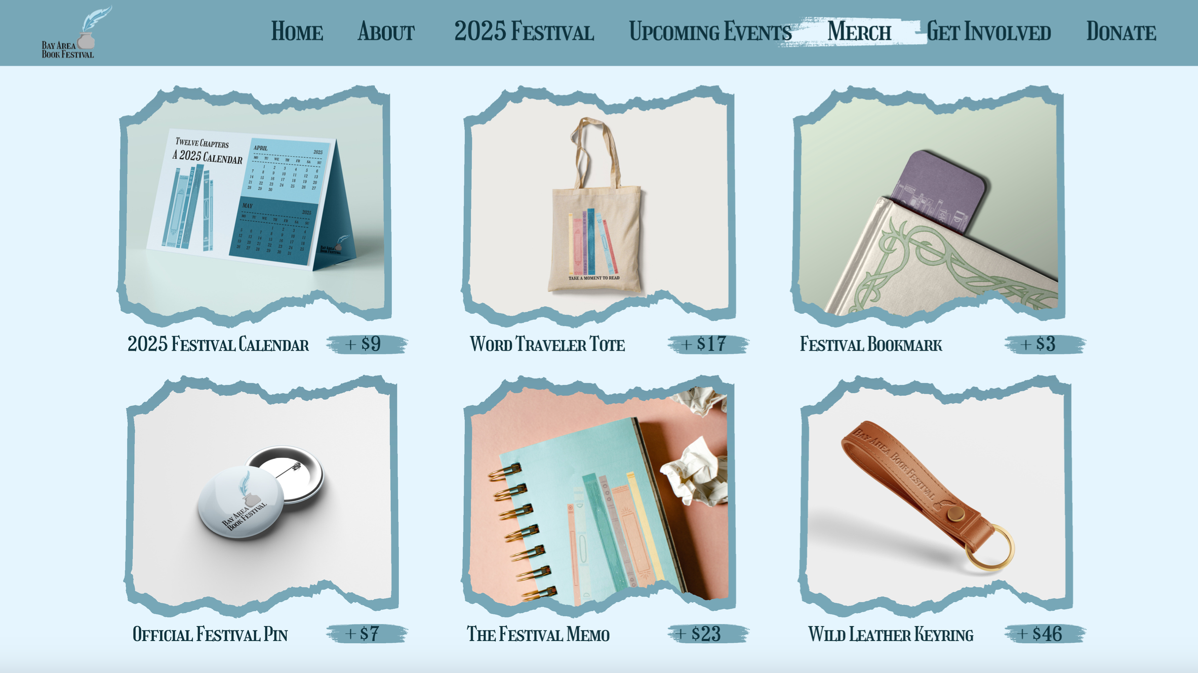
The merch line includes tote bags, bookmarks, and candles among other things. All designed to be both wearable and sellable while expanding brand recognition.


